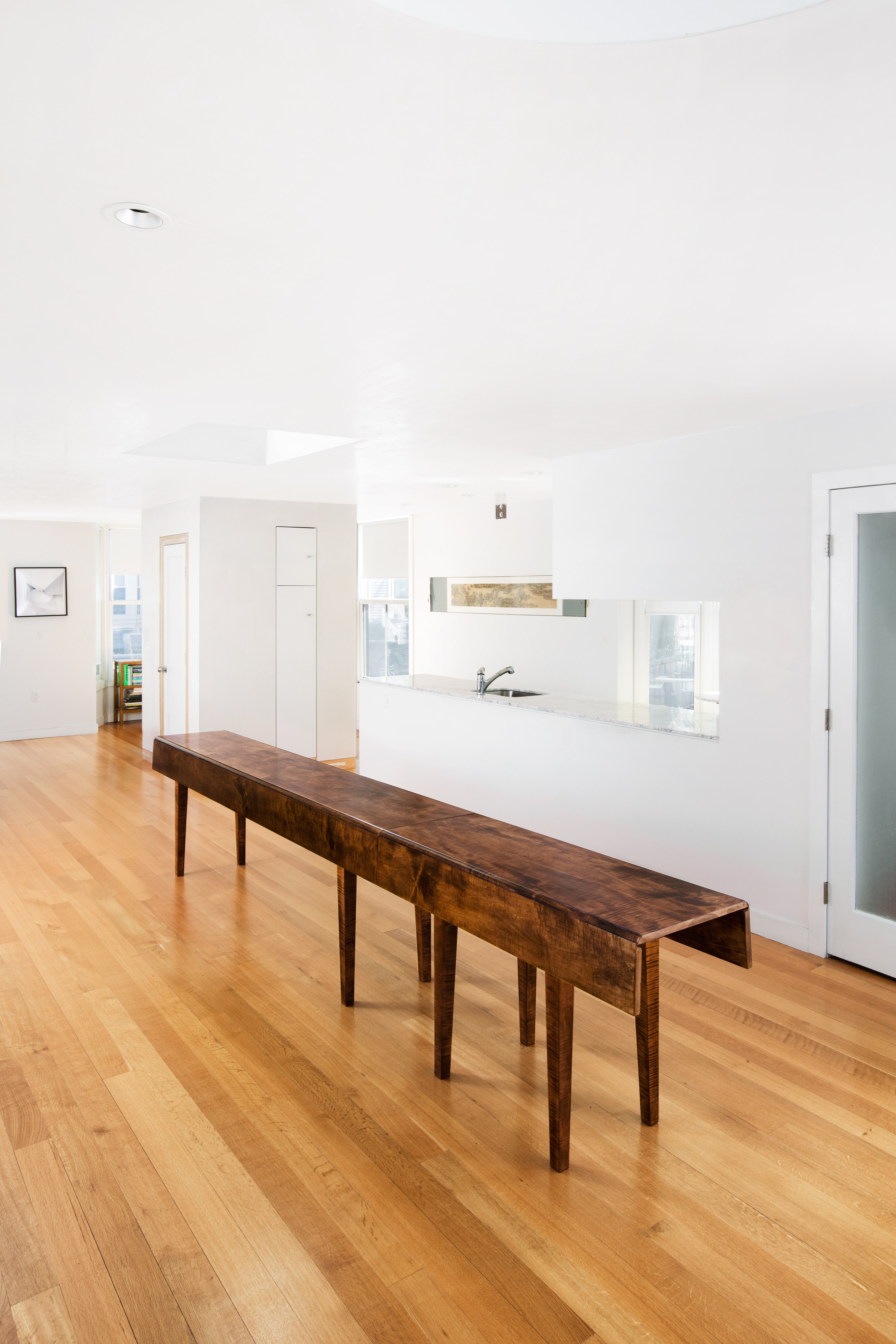
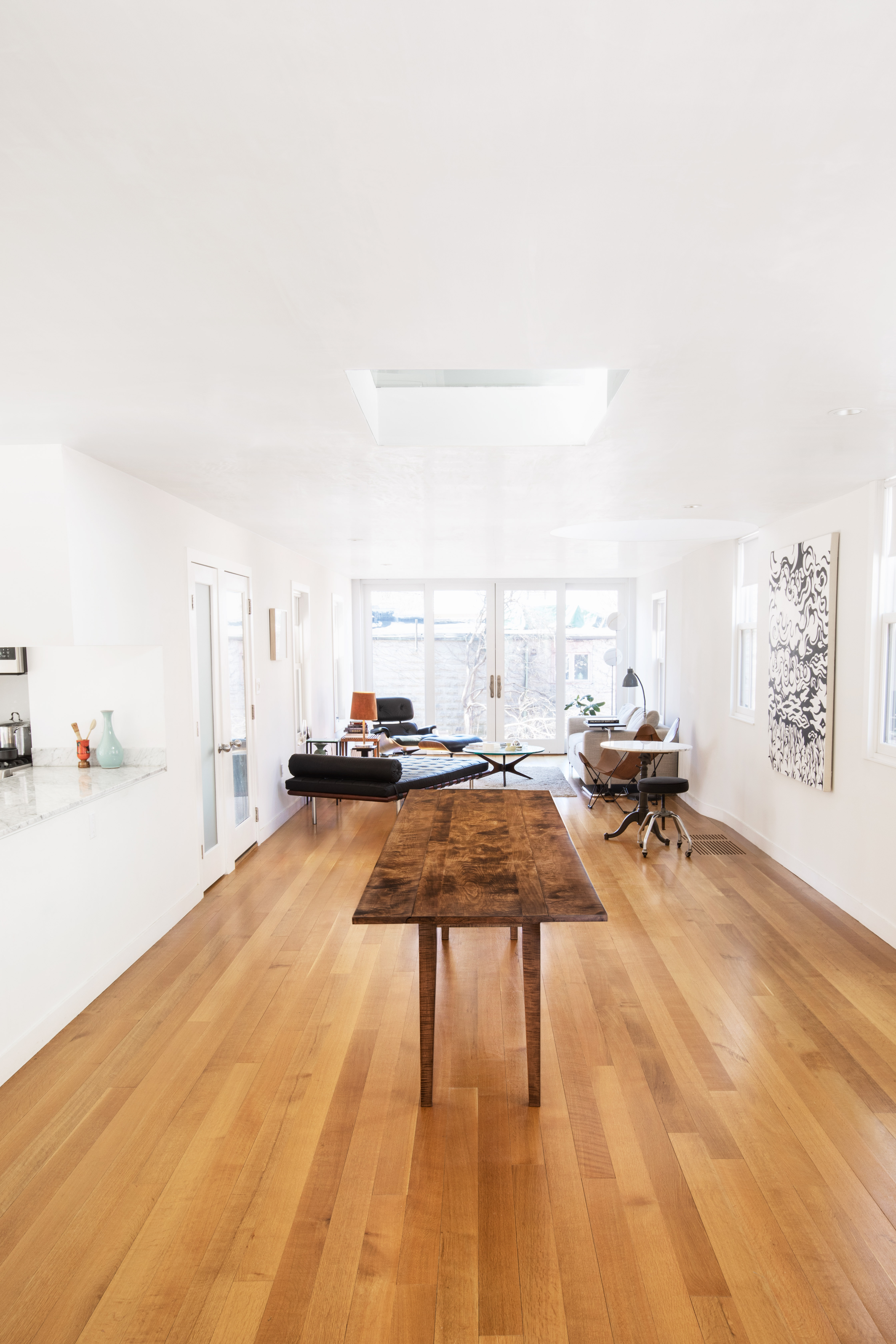
There are circumstances in which a piece of furniture is simultaneously autonomous and compositionally conjoined with a specific space. This table is highly determined by its architectural context in a manner analogous to the way in which a building is related to its site. In this case, the table had to be attenuated and centered under a ceiling window. Architecture can build itself around a table. Now the whole house appears composed around this piece of furniture. The table becomes something like the hearth of the house. Yet it is not permanent or rooted like a hearth. In contrast, all the other pieces of furniture are floating around loosely.
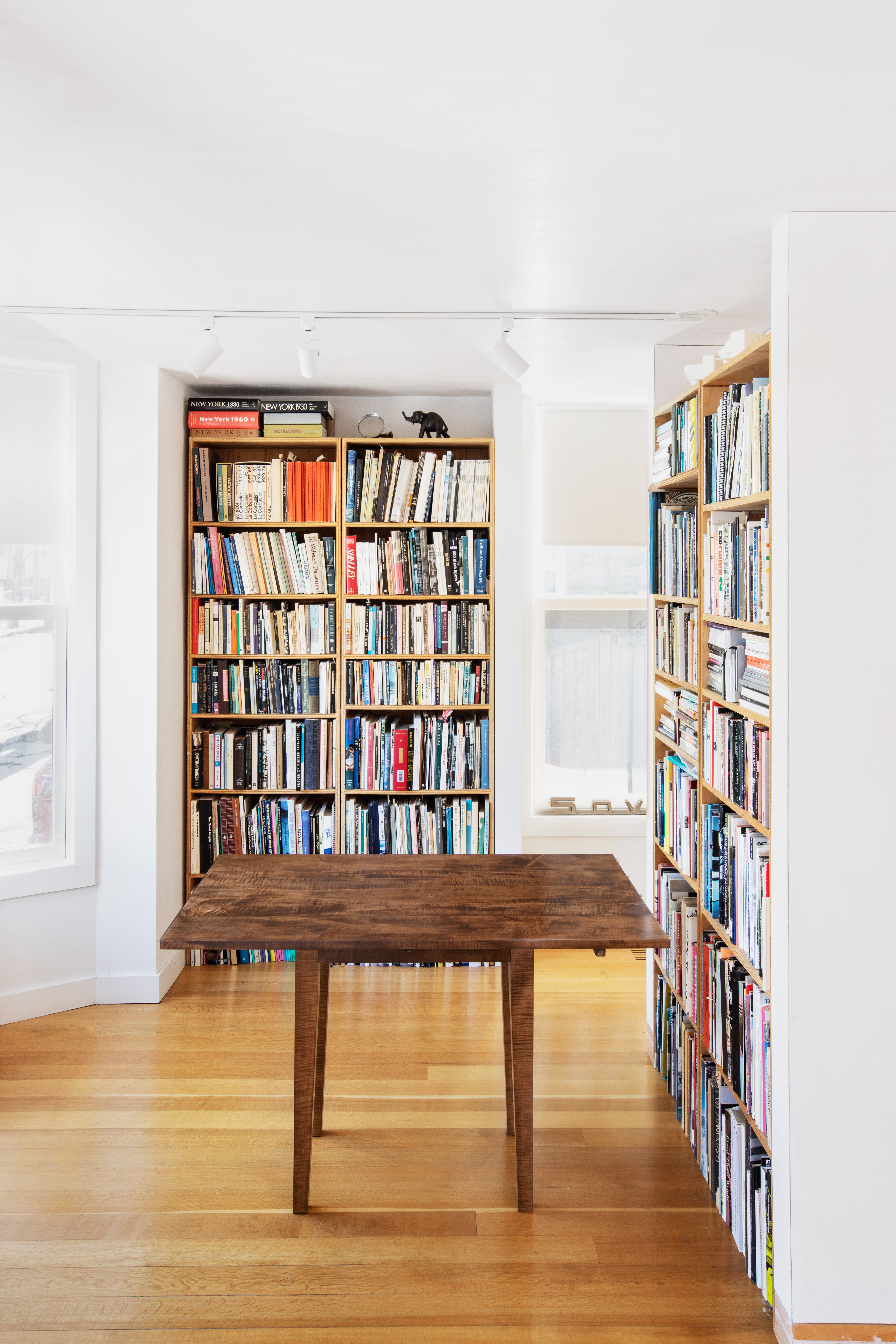
For everyday use, a 12’-6” long table would be unnecessarily long. So, it is divided into two separate tables that can be linked together, end to end: an 8-foot-6- inch table for the dining space and a 4-foot-long table for the small library. The distances between the table legs were determined by the dining arrangements. When the two tables are joined together by pegs and latches, the legs appear to be gathering up in a strange way, toward one end. The conjoined tables can seat twelve: five people on each side and one on each end. Two place settings straddle the seam between the two tables. This works because the legs are set one foot away from the ends of the two tables.
Why does this table have fold down leaves? First of all, because I couldn’t bear to put a dining table in this room. I felt that it would be a heavy, dominating object, like a parked bus in the middle of the house. The seats of chairs can slide under the table while the leaves are down, but you have to pull one leaf up to sit by the table or you have to sit alongside it.
The table is at once too long to be a typical Shaker drop leaf and detailed in a manner very similar to its precedent. The pattern of alternating wide and narrow boards turn the fully open table into a hidden drop leaf type. You would never expect that the table has fold down leaves, not only owing to the boards, but also because the flaps are so peculiarly narrow. The reason they are is because the total width of the open table needs to be narrow. I have always found that 30 inches is the correct width for dining, as opposed to 36 or 40 inches. So, when the flaps are down, it gets really skinny. It couldn’t be any narrower than 17 inches or it could be tipped over. When the leaves are down, it doesn’t interfere with the openness of the room and can be pushed up against the wall where it can hold books and objects or serve as a buffet. Normally, when it’s closed down and centered in the room, it looks somehow like a sacred space element. This has to do with its fixity relative to the architectural setting.
The table has an elusive functionality and character. Its darkness recalls some of the interiors of Adolf Loos. Dan Sherer reminded me that Loos, like Goethe, considered black to be the deepest of colors and white to be colorless. As opposed to nature and the interior, which are colorful, the facades of the city are white. Human subjects are colorful if you get to know them inside, as opposed to seeing them in the anonymous context of the city. It’s in the heart of the Raumplan that we find its richest color: darkness. The closed table stands as a dark central axis.
The wood is curly maple. The lively grain pattern means that it is not the species that a modest Shaker table would normally be made of. I showed pictures of the tabletop to Toshiko Mori before and after the first application of stain, and she insisted that I should only apply oil to it. She was very unhappy to see that it was being dyed. She was afraid this precisely designed table may get an unfortunate period look, like something you inherited from your uncle or aunt. In general, she prefers solid wood to acquire its own patina through use and exposure to light.
The dye converts the wood grain into ornament, essentially, in the sense that it reveals the wood’s inner form. In this case, it makes visible the curls in the maple. The stain is not added or supplementary decoration. So, while I can understand why Toshiko wouldn’t want to stain it, it can also be argued that to leave it natural in this instance, would be a stylish choice.
The table is not intended to look like a contrived or mannered version of a Shaker table. It’s peculiarity is not the result of voluntary formal manipulation. Rather it is perversely overfunctionalized, like the embrasure in San Carlo ai Catinari in Rome. It’s function that did it to it.
Design: Preston Scott Cohen
Furniture Maker: James Eddy
2019


